
米国医学研究者のDr. Pontaです。
今回はRでvisualization方法として最も便利で一般的に使われているggplotの使い方について解説します。
ggplotとは
ggplotは、データ可視化のための強力なパッケージであり、Rプログラミング言語のtidyverseと関連しています。ggplotパッケージは、グラフを構築するための方法を提供し、美しく、情報豊かなグラフを作成するのに役立ちます。
ggplotでは、データセットを指定し、それに対してレイヤーを追加していくことでグラフを構築します。例えば、散布図を作成する場合、データセットを指定し、x軸とy軸に対応する変数を指定します。その後、点や線などのジオメトリを追加して、必要に応じて色や形などの属性を指定します。これにより、データの構造や関係性を視覚的に理解することができます。
このように臨床データやオミクスデータを注目しているグループごと(TNMステージや年齢、遺伝子変異有無など)に図示し、論文として発表するときに非常に重宝します。もはや生命医学研究では必須のデータ解析ツールといっても過言ではないしょう。PythonだとMatplotlibが同じ立ち位置にあります。
以下、実際の臨床データを使用して使い方を解説していきます。
使い方
インストール
RのパッケージレポジトリであるCRANでtidyverseパッケージ群は管理されています。
# CRANからインストールし、読み込み
# ggplotはtidyverseパッケージ群の一部です。TidyverseをR環境に読み込むことで使えるようになります
install.packages("tidyverse")
library(tidyverse)
模擬データの準備
TCGAbiolinksを使用し、ダウンロード保存したTCGAの肺腺癌データセット(TCGA-LUAD)を例に使用します。TCGAデータの取得方法についてはこちらの記事を参照。
# TCGA LUAD Clinicalデータをロードする
load("data/TCGA_LUAD_clinical.RData")
どのようなデータがクリニカル情報として収録されているか、まず確認します。
# colnames()でカラム名を取得
colnames(clinical)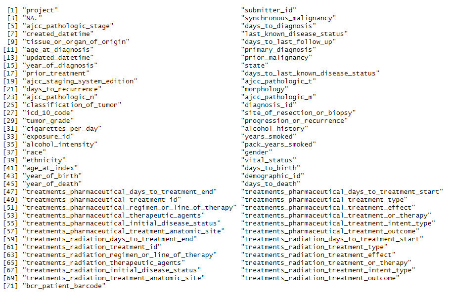
次にTNM Stage columnにmissing valueがあるので、解析前に除いておきます
# Missing valueを除く
clinical <- clinical %>% filter(is.na(ajcc_pathologic_stage)!=TRUE)
1. 散布図
簡単な散布図を作成
特に変数選択にここでは意味はないのですが、まず年齢とフォローアップ期間をプロットしてみます。x軸に年齢、y軸にフォローアップ期間を指定し、散布図を描きます。 ggplot()で使うデータセット、aes()内で指定したデータセットのどのカラムを軸に使うのかを決めます。 続けて、プロットタイプをgeom_point()とします。これは散布図を作成するときに使うGeomです。ボックスプロットならgeom_box()、ヒストグラムならgeom_histogram()と各プロット用にすべて別々に用意されています。ここでは最も基本の散布図で説明していきます。
以下では入力データオブジェクトとしてclinical、x軸にage_at_index、y軸にdays_to_last_follow_up、プロットタイプとしてgeom_point()をしています。
ggplot(clinical, aes(x = age_at_index, y = days_to_last_follow_up)) + geom_point()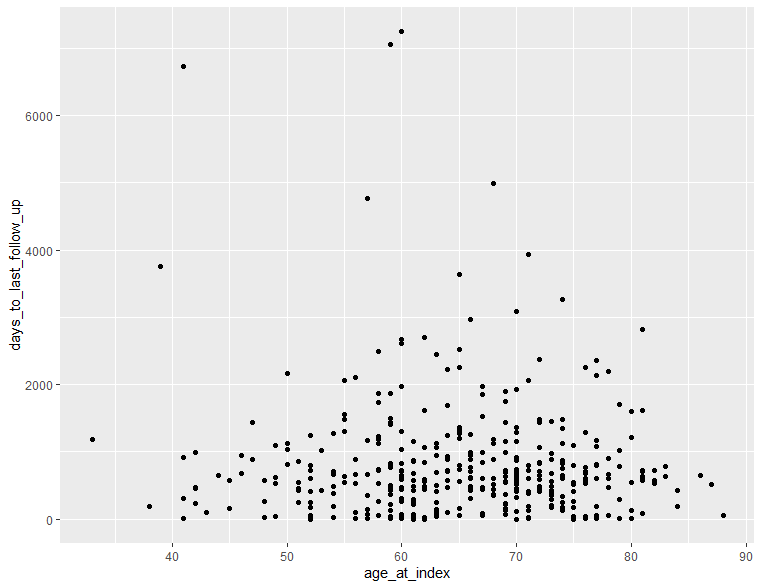
軸の調整
scale_x_continuous()、scale_y_continuous()で軸名、範囲、区切りを指定します。
ggplot(clinical, aes(x = age_at_index, y = days_to_last_follow_up)) +
  geom_point() +
  scale_x_continuous(name="Age", limits=c(20,100), breaks=seq(20,100,5))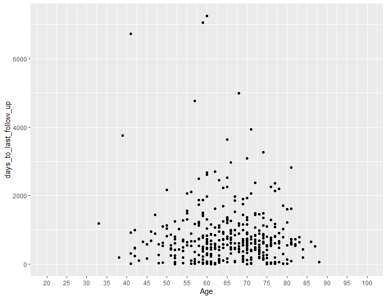
データポイントの色や大きさを変更する
geom_point(col=, size=)でcol、sizeを指定することでできます。
 ggplot(clinical, aes(x = age_at_index, y = days_to_last_follow_up)) +
  geom_point(col="red", size=3) +
  scale_x_continuous(name="Age", limits=c(20,100), breaks=seq(20,100,5))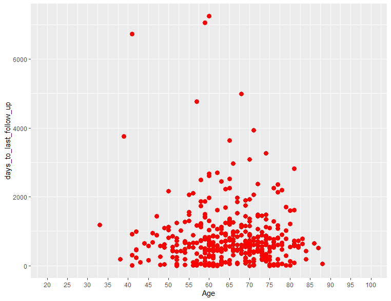
データポイント色を他データ因子で自動的に決める
データポイントの色を、関連する他の因子により決定し、色分けしたいときがあると思います。このようなときには例えば、TNMステージ毎に色分けしたい場合は以下のようにします。
ggplot(clinical, aes(x = age_at_index, y = days_to_last_follow_up)) +
  geom_point(aes(col=ajcc_pathologic_stage), size=3) +
  scale_x_continuous(name="Age", limits=c(20,100), breaks=seq(20,100,5))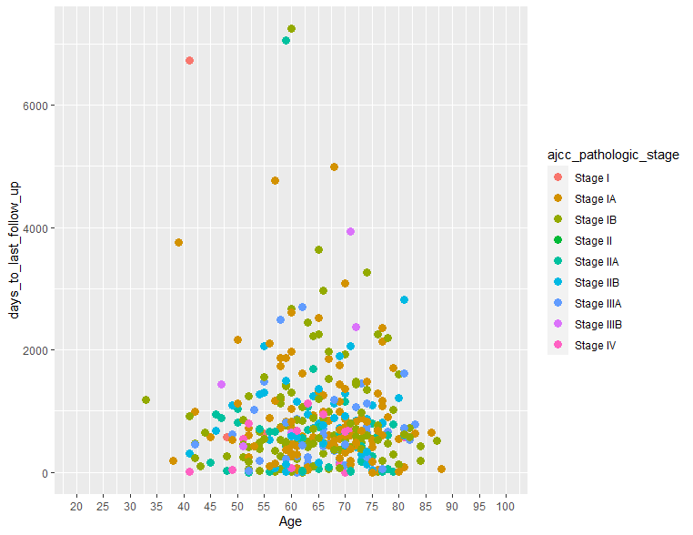
データポイント色を他データ因子で自動的に決める & 使用カラーパレットを指定
使用されるカラーパレットを指定したいときは、RcolorBrewer()を使います。使えるパレット色は以下のようなものがあります。
library(RColorBrewer)
display.brewer.all()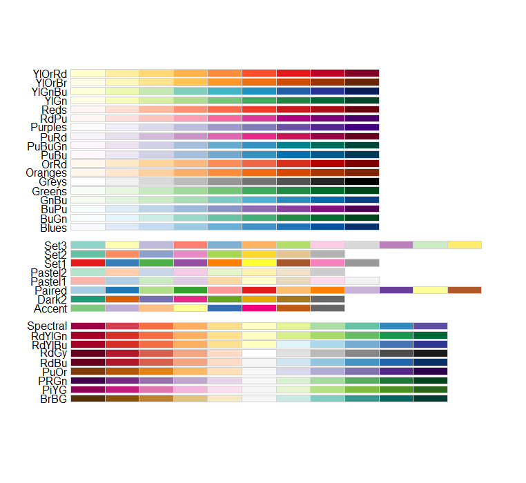
ここではSet1を使っていきます。
ggplot(clinical, aes(x = age_at_index, y = days_to_last_follow_up)) +
  geom_point(aes(col=ajcc_pathologic_stage), size=3) +
  scale_x_continuous(name="Age", limits=c(20,100), breaks=seq(20,100,5)) +
  scale_colour_brewer(palette = "Set1")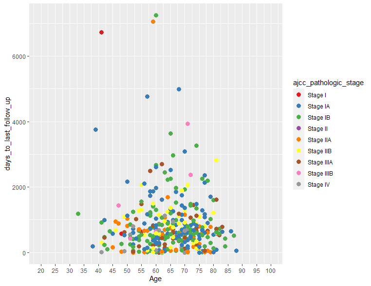
特定の変数ごとにプロットを分ける
各因子ごとにプロットを分ける必要がある場合は、facet()関連コードを使用します。いろいろサブタイプがあるのですが、ここではfacet_wrap()を使用します。ちなみにncolでプロットを横にいくつ並べるかを指定できます。
ggplot(clinical, aes(x = age_at_index, y = days_to_last_follow_up)) +
  geom_point(aes(col=ajcc_pathologic_stage), size=1) +
  scale_x_continuous(name="Age", limits=c(20,100), breaks=seq(20,100,20)) +
  facet_wrap(~ ajcc_pathologic_stage, ncol=3)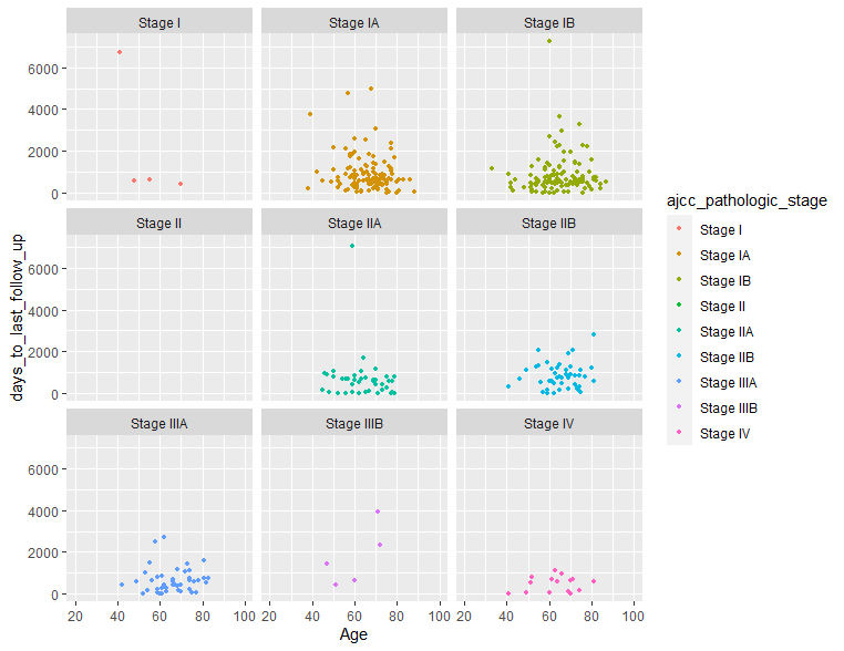
タイトルをつける
タイトルをつけるにはggtitle()を使用します。
ggplot(clinical, aes(x = age_at_index, y = days_to_last_follow_up, fill)) +
  geom_point(aes(col=ajcc_pathologic_stage), size=3) +
  scale_x_continuous(name="Age", limits=c(20,100), breaks=seq(20,100,5)) +
  ggtitle("Age vs Followup days")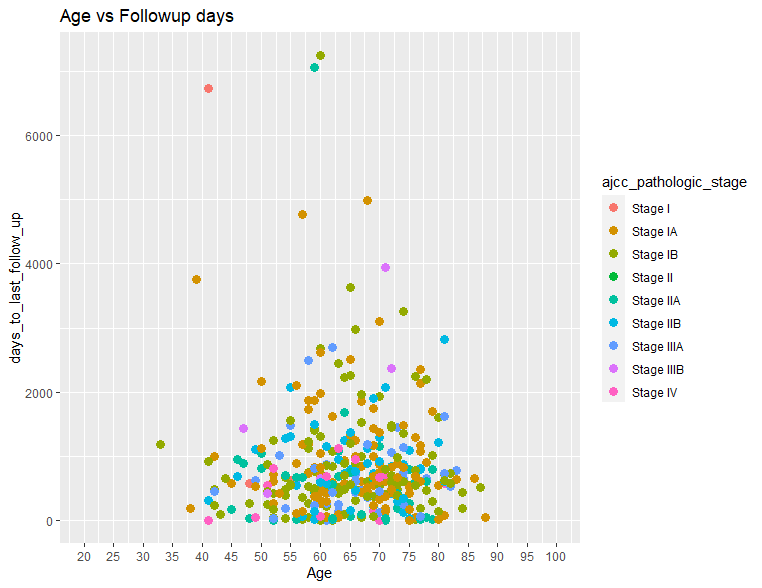
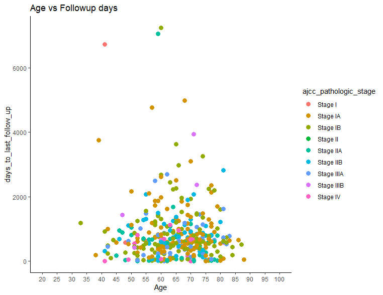
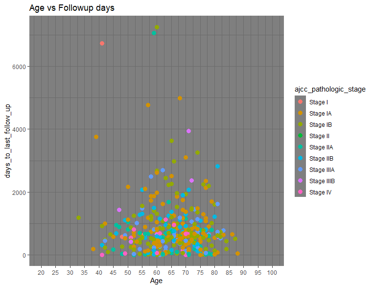
グラフテーマの変更
グラフのバックを白抜きにするとか、軸は太線にしたいとかは大まかにtheme()で対応できます。以下3つ例を示します。
# theme_bw() 下図左
ggplot(clinical, aes(x = age_at_index, y = days_to_last_follow_up, fill)) +
  geom_point(aes(col=ajcc_pathologic_stage), size=3) +
  scale_x_continuous(name="Age", limits=c(20,100), breaks=seq(20,100,5)) +
  ggtitle("Age vs Followup days") +
  theme_bw()

# theme_classic() 下図中央
ggplot(clinical, aes(x = age_at_index, y = days_to_last_follow_up, fill)) +
  geom_point(aes(col=ajcc_pathologic_stage), size=3) +
  scale_x_continuous(name="Age", limits=c(20,100), breaks=seq(20,100,5)) +
  ggtitle("Age vs Followup days") +
  theme_classic()

# theme_dark() 下図右
ggplot(clinical, aes(x = age_at_index, y = days_to_last_follow_up, fill)) +
  geom_point(aes(col=ajcc_pathologic_stage), size=3) +
  scale_x_continuous(name="Age", limits=c(20,100), breaks=seq(20,100,5)) +
  ggtitle("Age vs Followup days") +
  theme_dark()
2.棒グラフ
簡単な棒グラフ
棒グラフを描くには、geom_bar()を指定すます。例としてTNMステージごとの患者分布をバーチャートでみてみます。縦軸のカウント数は入力データフレームから自動的に計算されます。
ggplot(clinical, aes(x=ajcc_pathologic_stage)) + geom_bar()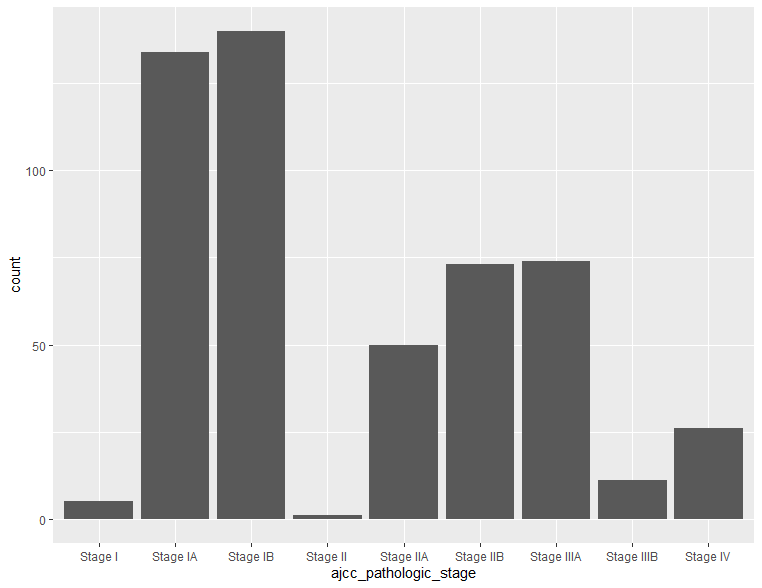
棒グラフの色変更
縁取りの色を変えるにはcolor, 塗りつぶし色を変更するにはfillを使います, バーチャートの幅はwidthで変更できます。
ggplot(clinical, aes(x=ajcc_pathologic_stage)) + geom_bar(color="blue", fill="white", width = 0.2)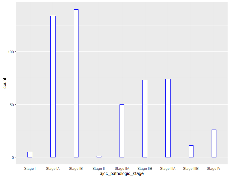
軸の入れ替え
軸を入れ変えるには二つの方法があります。y軸として最初に指定する方法と一度元の向きで作成してからcoord_flip()で軸を入れ替える方法です。
# y軸として最初に指定する方法
ggplot(clinical, aes(y=ajcc_pathologic_stage)) + geom_bar()

# 一度元の向きで作成してからcoord_flip()で軸を入れ替える方法
ggplot(clinical, aes(x=ajcc_pathologic_stage)) + geom_bar() +
  coord_flip()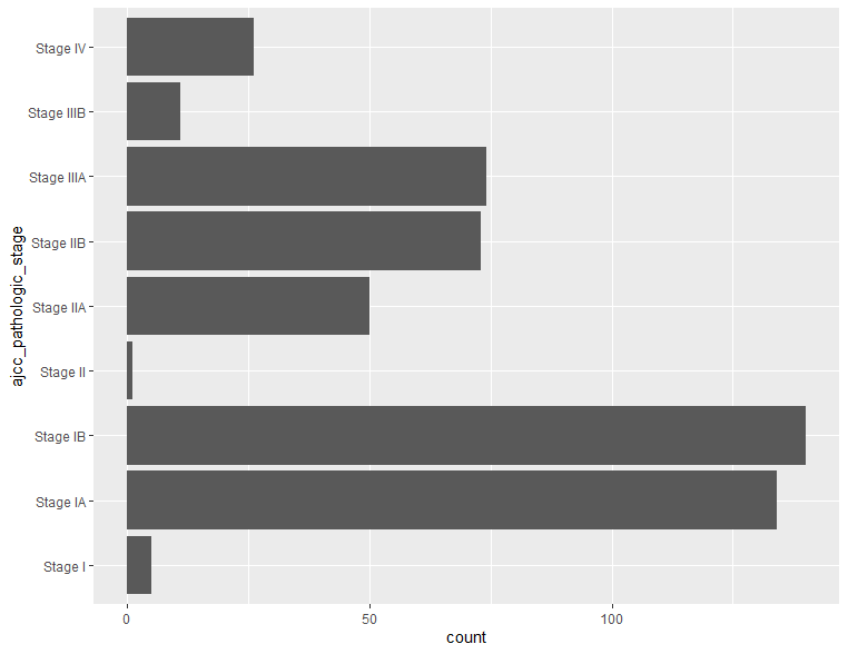
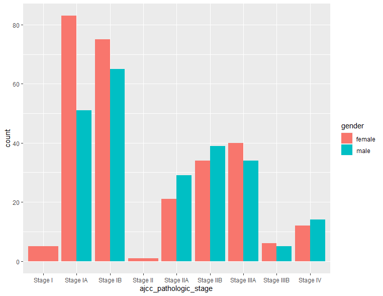
棒グラフに他の因子情報を追加
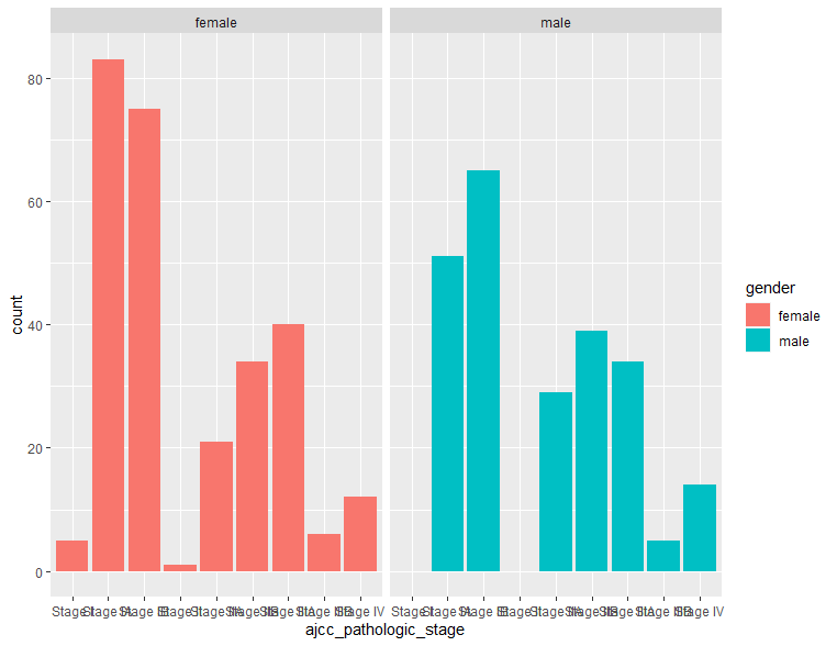
棒グラフに性別やステージ情報を入れ、各グループ因子由来のデータがどのような分布をしているかを明らかにしたい場合、fill=””を使用して、以下のようにできます。3通りの示し方を見てみます。
# 縦にスタック型する場合 下図左
ggplot(clinical, aes(x=ajcc_pathologic_stage, fill=gender)) + geom_bar()

# 横に並べる型 下図中央
ggplot(clinical, aes(x=ajcc_pathologic_stage, fill=gender)) + geom_bar(position=position_dodge())

# 別のグラフとして表示したいとき 下図右
ggplot(clinical, aes(x=ajcc_pathologic_stage, fill=gender)) + geom_bar() + facet_wrap(~gender)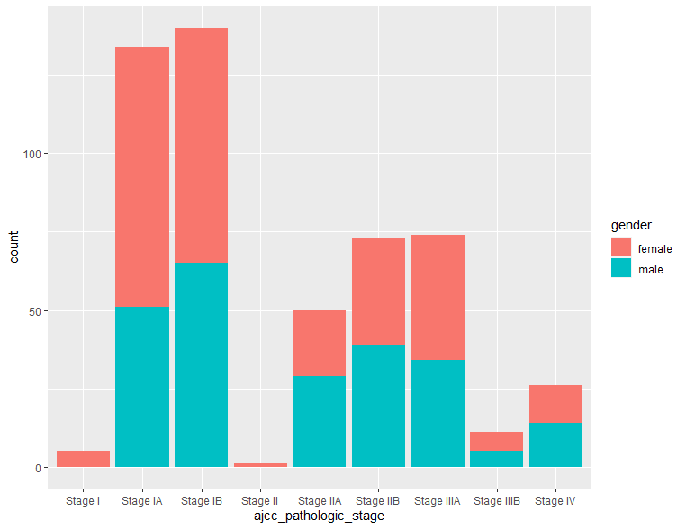
棒グラフの色をカスタム指定したい場合
色を自分で直接指定したい場合はこの方法でできます。
ggplot(clinical, aes(x=ajcc_pathologic_stage, fill=gender)) + geom_bar(position=position_dodge()) +
  scale_fill_manual(values=c('red','blue'))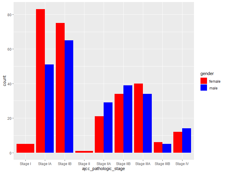
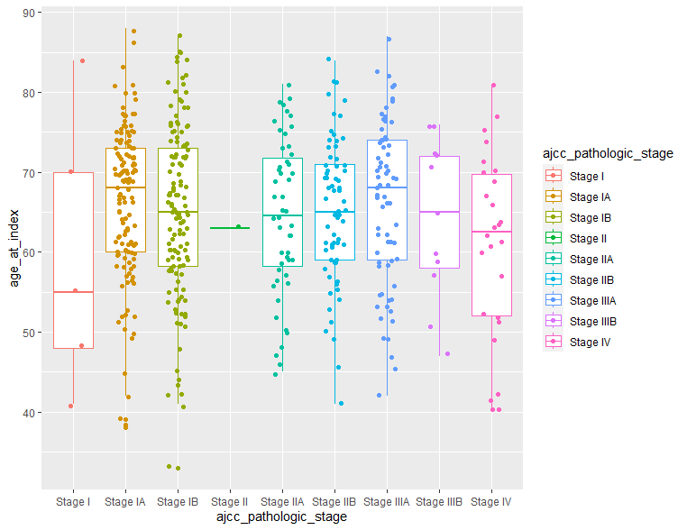
ボックスプロット
ボックスプロットも棒グラフや散布図と同じように作成できます。以下に二つだけ例を示します。ボックスの枠色はcolor、塗りつぶしはfill、データポイントの同時表示は geom_jitter()でコントロールできます。
# ステージごとの患者年齢分布
ggplot(clinical, aes(x=ajcc_pathologic_stage, y=age_at_index, color=ajcc_pathologic_stage)) + geom_boxplot()

ggplot(clinical, aes(x=ajcc_pathologic_stage, y=age_at_index, color=ajcc_pathologic_stage)) + geom_boxplot()+
  geom_jitter(position = position_jitter(0.2))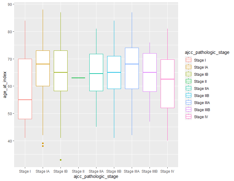
まとめ
今回はggplotを用いて基本的なplotの作成方法について解説しました。ggplotにはまだまだたくさんの描画機能がありますので、読者のみなさんも実際に体験してみてください。完全無料のggplotに慣れるとGraphad prismやエクセルには戻れなくなります。
今日も最後までお読みいただきありがとうございました。